Market Analytics
Know the shape of what you own.
The full historical return distribution of a stock — not just the average, but the tails you actually live through.
What it tells you
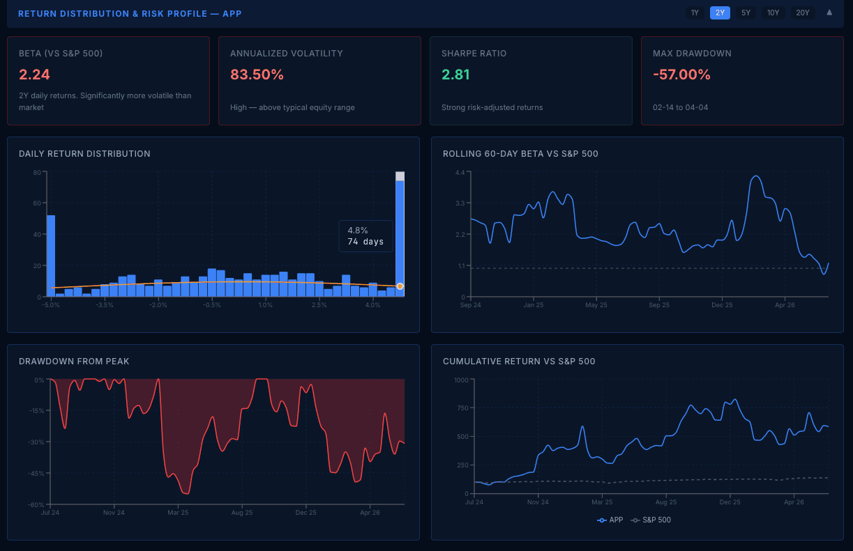
An average annual return tells you almost nothing about the experience of holding a stock. The Distribution of Returns view shows the whole shape: how daily returns cluster, how fat the tails are, and how deep the drawdowns go — with the dates they happened. Two stocks with identical average returns can be radically different investments — this chart is where that difference becomes visible.
Who it's for
For investors who understand that risk isn't a number — it's a shape.
How it works
- Daily dividend-adjusted returns are computed for the stock and the S&P 500 (via SPY) over a selectable lookback window of 1 to 20 years.
- A histogram of daily returns is overlaid with a normal curve of the same mean and standard deviation, so fat tails and skew are visible directly — no statistics degree required.
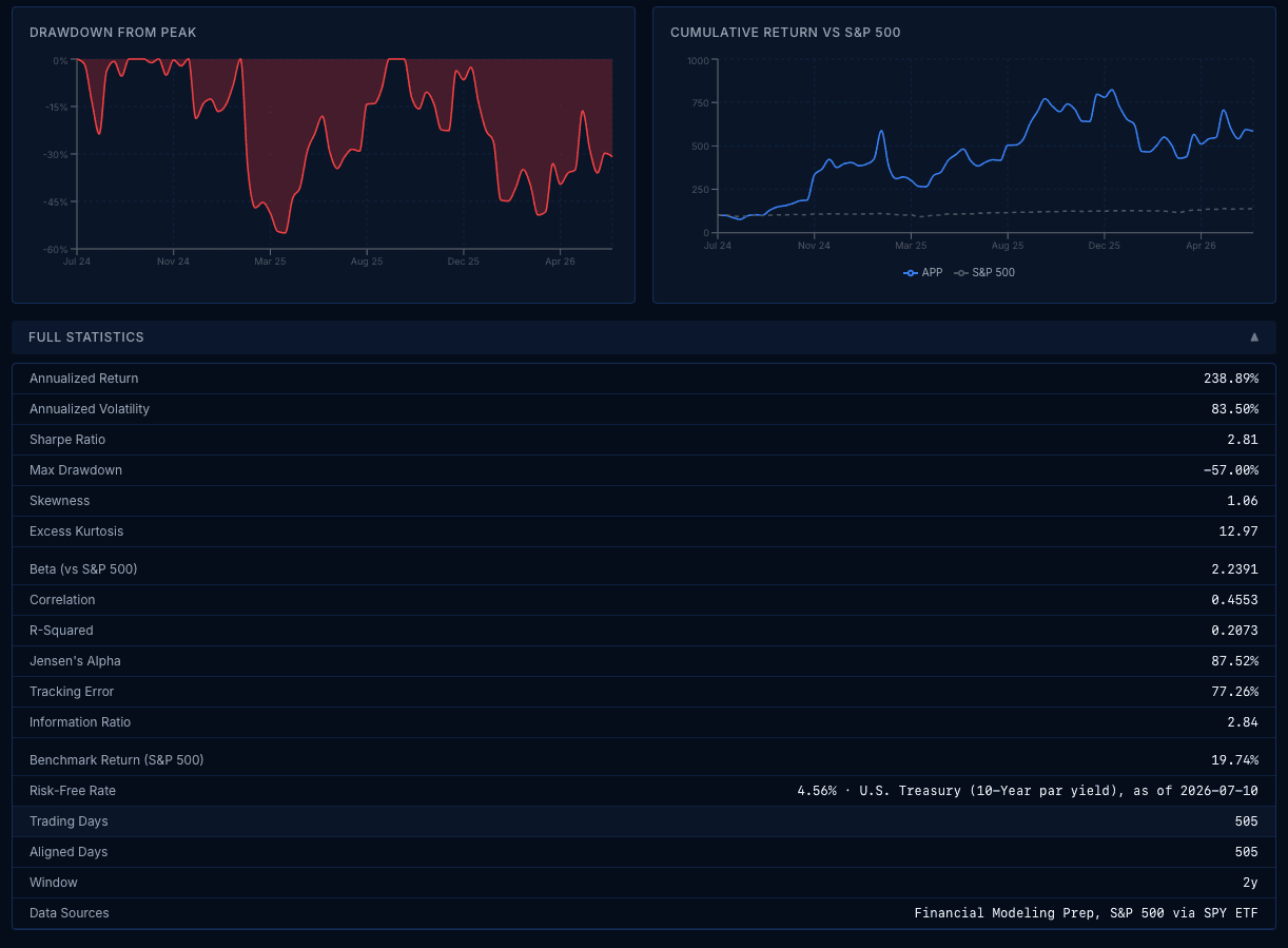
- Sixteen statistics per run: beta, Sharpe ratio, Jensen's alpha, tracking error, information ratio, skewness, excess kurtosis, max drawdown with its dates, and more — beside rolling 60-day beta, drawdown-from-peak, and cumulative-return charts.
- The Sharpe ratio uses the same live 10-Year U.S. Treasury yield as the platform's DCF discount rate, displayed with its as-of date.
- Its forward-looking sibling, the Monte Carlo Simulator (Institutional), turns the same daily-return statistics into 10,000 simulated price paths — a banded fan chart, a terminal-price histogram, and probability tables for price levels you choose, under a model, drift, and sample window you control. Every figure is conditional on those stated assumptions: it is a price-process tool that says nothing about fundamental value, and identical inputs on the same price data reproduce identical results down to the displayed random seed.
Included in Professional
5-year windows on Professional · up to 20 years on Institutional. Server-enforced.
Questions
- How is this different from volatility?
- Volatility compresses the entire distribution into one number. This shows you the distribution itself — including the asymmetries a single number hides.